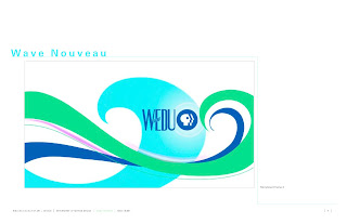
Cut it up, mash it up, invert it, reverse it, invert it again, add something, subtract something. HOW WOULD IT MOVE? And then you should probably invert it again....
Riko's GC246 Blog: Type II
Thursday, April 19, 2012
Monday, April 16, 2012
DO IT NOW...
...instead of at 3am this morning ^__^
We played around with our texture/source material stuff in class today. I'm so burnt out I have no idea what I'm doing anymore....
We played around with our texture/source material stuff in class today. I'm so burnt out I have no idea what I'm doing anymore....
Thursday, April 12, 2012
Get lost
So, we were told to "get lost." Which I would have loved to do, except I didn't. Not really. I got lost at the mall. Which is the worst place for me to get lost at. I don't like the mall, but I happened to be there, and I happened to have a camera. So, voila!
Monday, April 9, 2012
Le Book
So here's my "concept book," for type class. I'm afraid I may have over-designed it. That's my tendency...
I was between "super student work" and "looks professional." Maybe I didn't over-design as much as I thought, but I still think that less might be more....although, I dunno. I'm kind of ok with it, or I like it, I can't tell. Is that weird? Seems weird. I ought to be more decisive. It's not brilliant....I don't like it that much. And it doesn't totally suck balls, and I'm ok with that.
I guess I wish I had more space this semester to really get a better understanding of this whole grid thing, and layout design. The more I got into it, the more I caught on, and the more I liked it. It makes sense, you know. But designing something that really makes sense is another animal, I think.
Thursday, April 5, 2012
It's in the details
Notes on designing our own template for the concept books....
Template:
- how do you show Ringling College?
- What if it were your design company?
- what grid would work a 6 panel, a 9 panel?
- would the cover be the same, or a variation?
- how would you use the grid for a longboard?
**think of how to present the info at the bottom
Template:
- how do you show Ringling College?
- What if it were your design company?
- what grid would work a 6 panel, a 9 panel?
- would the cover be the same, or a variation?
- how would you use the grid for a longboard?
**think of how to present the info at the bottom
Monday, April 2, 2012
Revise the concepts
And here we go, refining the concept layouts. This time including our own copy, describing the visuals. I think this made it much easier to design with, honestly. I feel as though I was more thoughtful in the overall layout design, than I was previously. And that's ok, I mean....trying different things is imperative to learning.
Friday, March 30, 2012
Bring on the concept
Now we needed to try a new grid, and include images from our concept class. The idea being, to imagine the page layouts as being relevant and having intent when placing type and image. I still wasn't quite there with this step, yet. Since the copy and image don't relate, I wasn't really relating them when I was laying things out. I was just trying to get some interesting results, if I could.
My biggest issues came where I was trying to really integrate the image with the copy. It wasn't the most successful thing, that's for sure. I think with the shapes I was using, it was too difficult to structure around. Either that, or I was trying too hard to fit the structure around the image. It just doesn't make total sense. I think my common denominator for every project I've ever done has come up again: simplify. Although, I'd like to point out that these particular bodies of copy are like stupid to work with when trying to put them "in context" with storyboard images. I WOULD NEVER WRITE THAT MUCH FOR A CONCEPT BOOK, EVER. At least not on a single page. (referring specifically to the Crystal Goblet text, and the excerpt from Hamlet)
Just no.
Subscribe to:
Comments (Atom)


