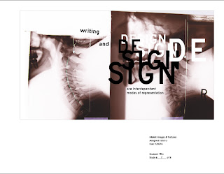
Thursday, February 16, 2012

Day 10


Thoughts:
  • image and type are better mixed intuitively, without thinking too hard
  • it's hard to not think too hard
  • Dorian loves the 90s
Class notes:
  • my studies could use more structure, or decisiveness - my goose is too loose and things are fairly ambiguous throughout (esp. the one with the boy's photograph)
  • the x-ray study was the champion today (Dorian loves the 90s), a little tweaking will give it just what it needs
  • the textured one (up top) is something Dorian was digging, but it's got a little bit too much going on ~ also ambiguous, though the visual elements could definitely be working well if I chopped em up a bit, sautéed em, and seasoned it
just a few examples, there

After thoughts:
  • sometimes working at 3am, and not being capable of really thinking straight pays off (in design at least)
  • but that suffices for merely "ok" foundations to build something more structured on after you've gotten a good meal and a full night's sleep
  • the madness needs a method, and the chaos needs some structure

The TED talk we watched was about getting what you give in design. Your success is intimately related to how much time you put into your work.  

Monday, February 13, 2012

Motion Studies 5 3/16

Day 8

I think my studies were all pretty lame. I'll be honest, I didn't read the article until after I made these - so they lack deconstructionist influence, and probably a lot of interest too. 


Type and Destruction [reading response]

I somewhat agree with Zuzana Licko in that no type face is inherently legible, but our familiarity with a face accounts for its legibility. Although, when I think about reading almost any sans serif font for the first time (pretending, for instance, that I haven't ever seen Helvetica) next to some other more ornate font that I also have never seen before, I am of the belief that I would be able to read the sans serif faster and with greater ease than the other. But then...maybe that's only a sign of the times.

"...impermanence and potential for chaos, which is a basic condition of the digital medium."

This is kind of an eye-opening read for me. I never had any idea so many designers put so much thought into creating type faces, it was something I never thought about - they were just different styles to choose from on the computer. I find it interesting that a lot of faces were like bastard children of their generation, from even before now. There's a whole destructive approach and irreverence to convention and legibility.

I think it'd be fun to try playing with this in my own work and explorations - but I don't think it'll come too naturally. My mind doesn't know what to do with this yet @___@

Monday, February 6, 2012

Day 7


So I only had 2 of 8 animated studies to show today. But my first one was well liked :)
My second composition needs some adjusting, the bottom lines dont line up and altogether
the reading gets jumbled between statements.

And 6 more to go.


c l a s s    n o t e s


  • diagonals need to be intentional, not goofy, unless they are intentionally goofy
  • have the exits make as much sense as the entrances 


quote of the day:


T: "I thought they felt cute"
D: "Cute in a good way, or cute in a bad way?"
T: "Cute in an excessive way."

Day 6

Today we dove into display faces.

They can be tricky.

And weird.

And ugly.

And cool.

I'm still getting my bearings with this whole "typography" bag...so nothing I did was particularly of note one way or the other. Although during crit one of my compositions did make it to like, the final 2 was it? Hahaha....yeah, whatever :P Good fun.

I have the feeling this will all click for me in due time. And I'm excited for whenever that happens. Till then I'll just keep making ugly stuff ;)

Sunday, January 29, 2012

Motion Studies


Being restricted to moving the type in only x and y was an interesting challenge. It's kind of hard not to mimic everything I've already seen with kinetic type, it's also hard to not repeat patterns, which seems inevitable. I tried not to over think it, and I think the kinetic studies came out a'ight. The timing in every single one of them could be ironed out a bit, at specific parts for each one. For the most part I think the pacing of all of them is OK...granted I've been staring at the monitor for a few hours and reading the same phrase the whole time, so maybe I'll wake up tomorrow and realize how god awful they are. Hahahah

Edit:

crit notes yo'

- I nailed it on the last composition with the sizing of the type, not to big, nay too small (well, really, just...not too small). Dare I say, the baby bear of my studies ("juuuussst right") we all learned a bit about how small you can go without going too small for screen (14px-29px)

- one of my compositions is too small, which was obvious when shown on the projector. I had been staring at these too long last night to notice, woops

- things to keep in mind (in general): don't just introduce one level of variation, make it 2 or 3. And ask yourself if every frame is interesting as you review your work (obviously it's not really possible to necessarily make every frame a stunnah, but more or less keep the motion, and key points visually compelling)